
Buttons (legacy)
How do I add buttons? How do I present buttons that users can choose?
Buttons are simple, clickable or selection elements that your chatbot or assistant can send to users to showcase different options.
Their significant advantage is the fact that they let chat visitors specify their needs without formulating them. A person who sees a button can choose the information or option/intent they need or are interested in, without even typing a word in the chat input.
Buttons are also a good solution for conversation designers as they help assistants/chatbots sustain a conversation, as users can always return to them. If created well, they can significantly improve the user experience.
Functioning similar to Choice steps, Buttons are used commonly in Chat Assistants to present choice paths, options, or decision/input points to help progress in the conversation. Keep in mind that for some platforms like Alexa, buttons are not supported, and the Step will not be available on your canvas.
In chatbot contexts, they are often buttons that your end user can select in order to progress the conversation.
For Chat Assistants, the Button Step can be used to prompt users with quick replies and present choices. It can also be used to open-ended prompt users with intents as its choices, or in combination with buttons.
Note:This step behaves and functions similarly to the Choice step, including associated features including Intent Editing/Creation Workflows, Scoping, previewing No Match/No Reply and many more!
A Button step in many use cases, such as customer support, payments and account management, and website inbound queries, would be useful in explicitly outlining possible actions by the user.
- As an example, a customer support assistant is configured for three functions (check refund status, update customer profile, connect to live agent). The assistant can ask with a text or speak step (depending on chat or voice modality) "how can I help", then present the three possible actions in a Buttons step for the user to select.
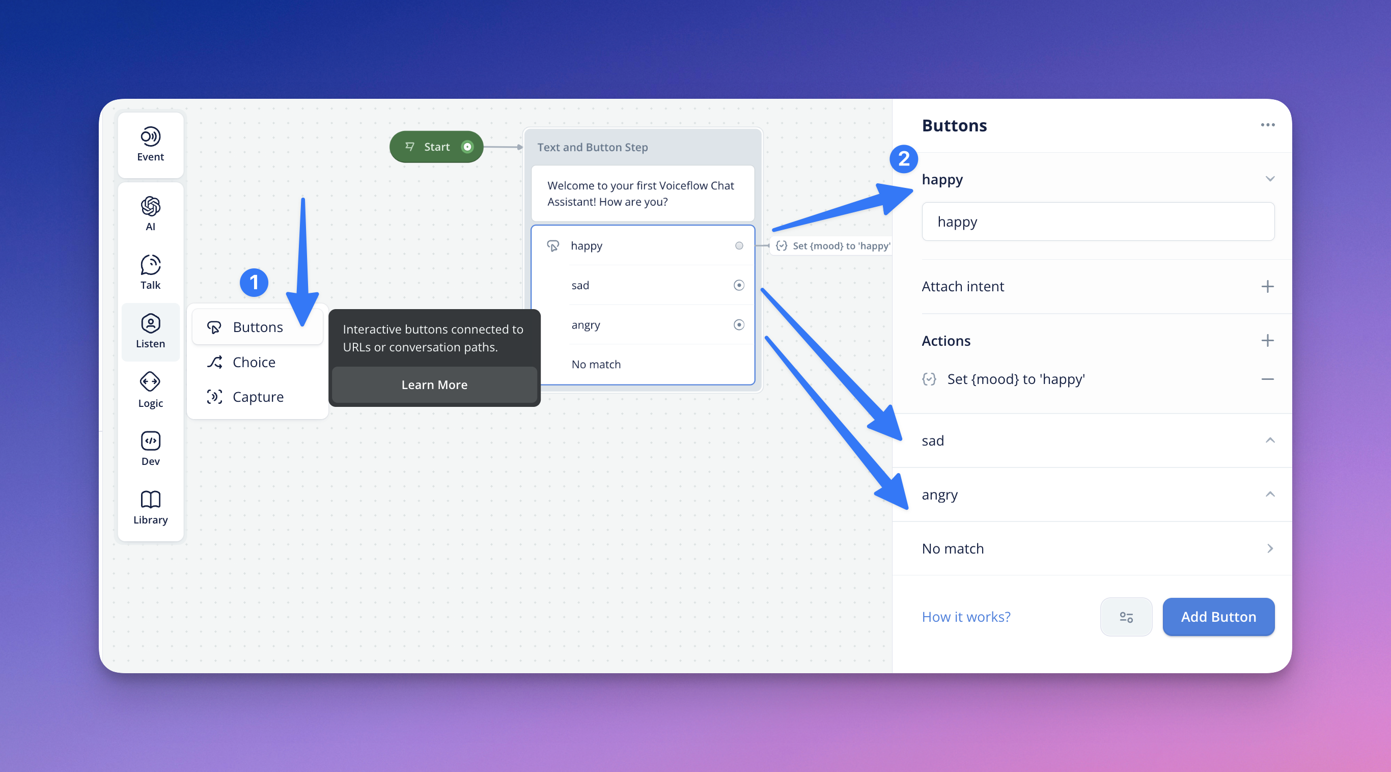
Configuring Buttons
By default, your Button step will be listening for all intents, waiting for the user to prompt and guide the conversation. You can add additional buttons by clicking Add Button (similar to Add Choice for Choice step ).
You can configure your button labels in the button text input field, and define what happens when it is pressed:
- Path — you can use the port in your Button Step so that it can be linked to another part of your flow. In the Prototype and Test Tool, when the button is clicked, it will navigate the user down that path in the flow.
- Attach Intent — selecting an intent from this dropdown will match that intent when the button is pressed. If you have the 'Path' connected, it will still follow the path you have linked. Similar to the Choice step, you can edit your intents directly from this step, as well.
- Actions — you can use Actions to nest navigation and backend logic in a single Choice within the step. This includes Actions & call-to-actions such as Open URL, API Calls, and many more.
Intent Scoping
As indicated above, your Button step will be listening for all intents by default, waiting for the user to prompt and guide the conversation.
If you want to limit the scope or access from the Button step to the intents contained in solely the step, you can click the settings icon located to the left of the Add Button button, and select Intent scoping. From there, you have the option of configuring Listen for all intents or Only intents in this step.
No Match in Button-Step
There may be instances where your user submits an input that doesn't match the choices in the Button step. For these cases, you can define what happens when the assistant detects a 'No Match'.
In the 'No Match' section of the Button(s) path, you can choose whether you want to reprompt your users and/or configure a fallback path. You can configure both options below to utilize both features.
- To add reprompt options, input the intended No Match response in the text input field. You can add additional reprompts by hitting the (+) button or remove with (-).
- To connect your No Match to a conversation or fallback path, select 'Path' and hit the (+). This will let you select the conversation path for your fallback.
Should you configure a fallback path, you also have the option to add Actions. You also can rename the No Match path, for your reference on the Canvas. You can also remove paths with (-).
In the 'No Match' section, you can choose whether you want to reprompt your users and/or configure a fallback path.
To add reprompt responses & variants, input your desired reprompt response in the text box. You can hit the (+) to add additional variants/reprompts of the No Match responses.
To connect your 'No Match' to a conversation path, select 'Path' as your No Match type. This will let you select the conversation path for your fallback.
No Reply in Button-Step
If the assistant does not process or understand your user's response, or the user's response is unintelligible, the No Reply Response occurs. To define your No Reply response, access the more options menu by clicking the ellipsis button in the Choice step, and select 'Add no reply'.
You can configure your No Reply response message, the time delay, and connect it to a conversation path.
Should you configure a fallback path, you also have the option to add Actions. You also can rename the No Match path, for your reference on the Canvas. You can also remove paths with (-).
Tip: No Reply Responses only occur twice and will exit the app if the assistant still doesn't understand after a third attempt.
Previewing No Match/No Reply on Canvas
Functioning similarly to Choice steps in Voice Assistants, configuring No Match and/or No Reply on your Buttons step, a preview menu will also appear when you are navigating on the Button-step from the Canvas.
To preview it, you can navigate back to the main desired Button step and select the question-mark bubble (?) for No Match or time bubble for No Reply.
You will notice the no-match or no-reply responses configured appear under the Button intent/path. Clicking the copy icon, copies this content/data onto your clipboard. The Edit icon will take you to the editor.
Tip: Viewer-level stakeholders on your canvas are still able to access this preview menu, but will not be able to access the Editor and its icon.
Button Layout Options
You can set how you want your buttons to appear in the Prototype and Test Tool, using the options found in the '...' menu, under Buttons Layout:
- Stacked — this will display your buttons stacked vertically, left-aligned in the chat
- Carousel — this will display your buttons horizontally, so the user can scroll through them in the chat
Updated about 2 months ago