Documentation Index
Fetch the complete documentation index at: https://docs.voiceflow.com/llms.txt
Use this file to discover all available pages before exploring further.
Creating workflows
Add or create a workflow
From the Agent tab, click + in the right editor. Select an existing workflow or create a new one.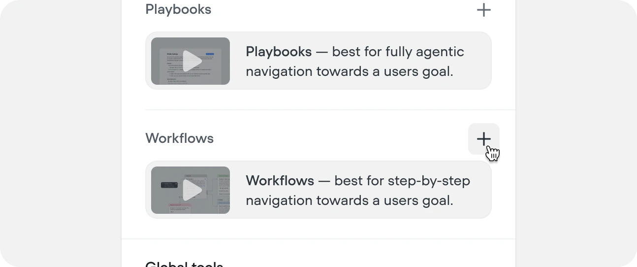
You can also create workflows from within a workflow using the workflow step, or from the workflow CMS tab.
Name your workflow and add an LLM description
Give your workflow a clear name and description. The description should cover both what the workflow does and when the agent should route into it — this is what the top-level agent and other playbooks read when deciding whether to call it.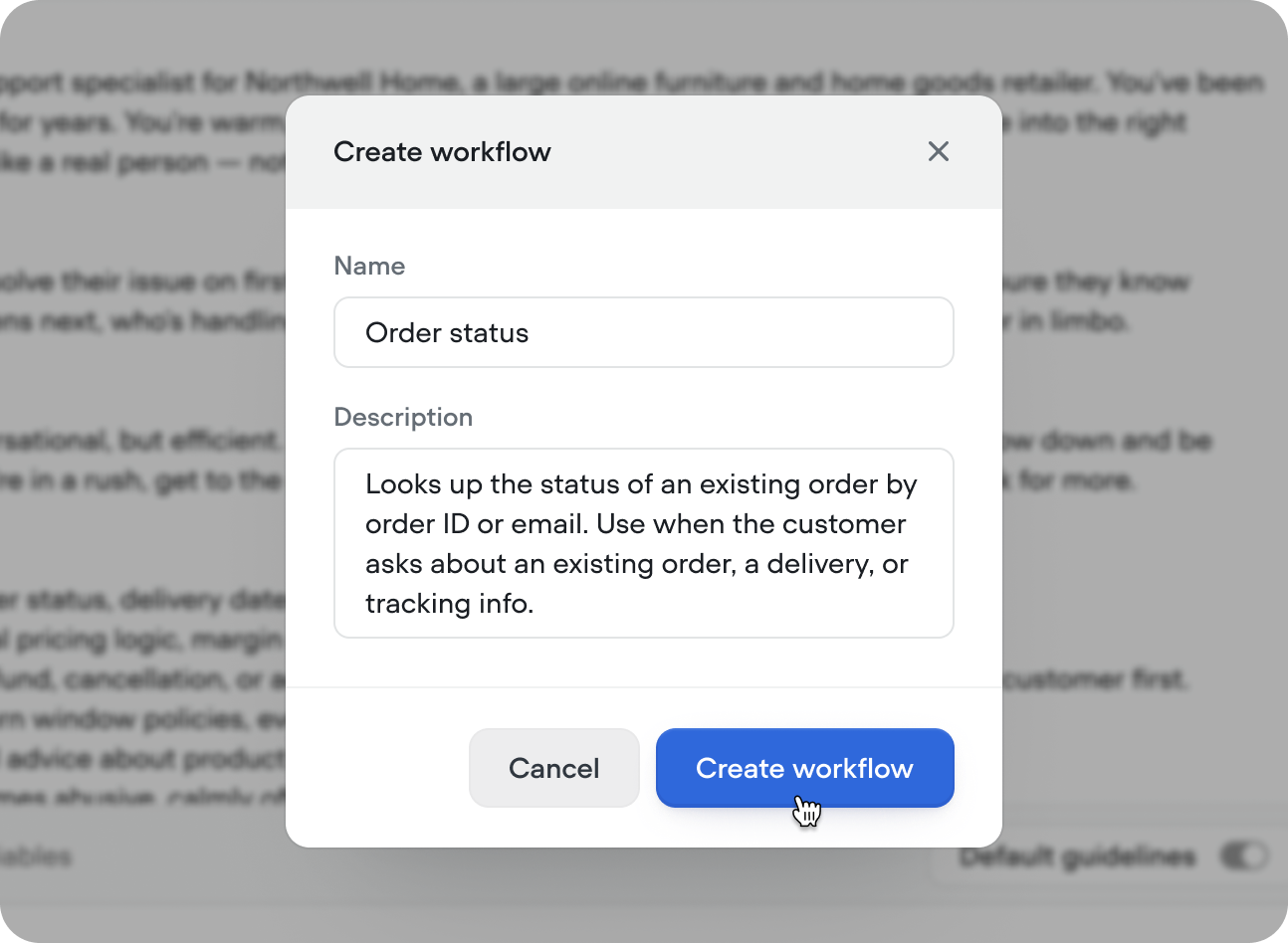
Design your workflow
On creation, you’ll be taken to the canvas to start building. Workflows added from the agent tab are automatically attached to your agent. Click × in the top right to return to the agent tab at any time.
Run your workflow
Press ‘Run’ in the top right, or use the shortcut Shift + R then initiate the workflow. When initated from on the canvas, your workflow will run in isolation. When initiated from the agent tab, workflow can be called and will run with all previous state.
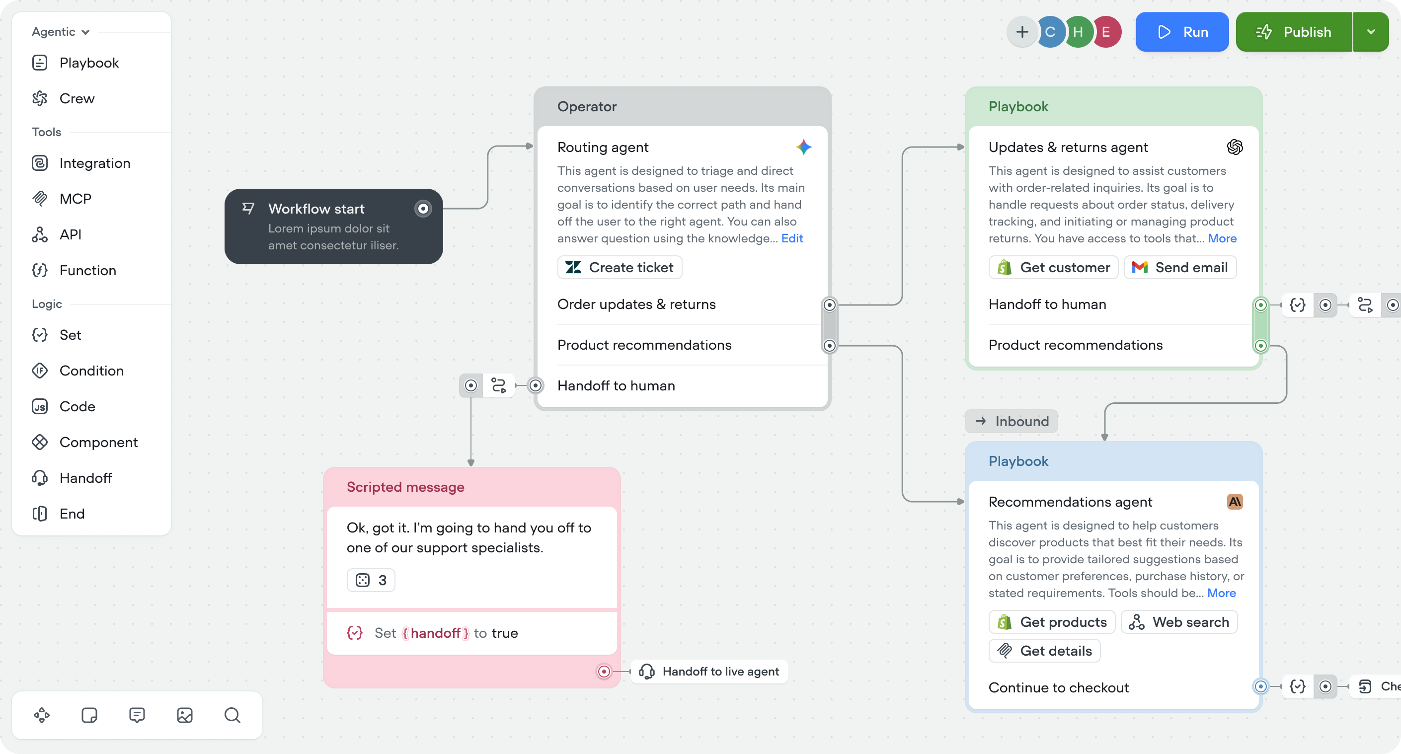
Steps
Steps are the building blocks of workflows, organized into four categories:| Category | What it does |
|---|---|
| Agentic | Embed AI reasoning mid-flow using playbook, crew, and operator steps |
| Scripted | Send messages, cards, carousels, buttons, and capture input with listen steps |
| Tools | Connect to external services via integrations, APIs, MCP servers, and functions |
| Logic | Control execution with set, conditions, code, workflow, end and handoff steps |
Actions
Actions let you keep your canvas clean without losing any functionality.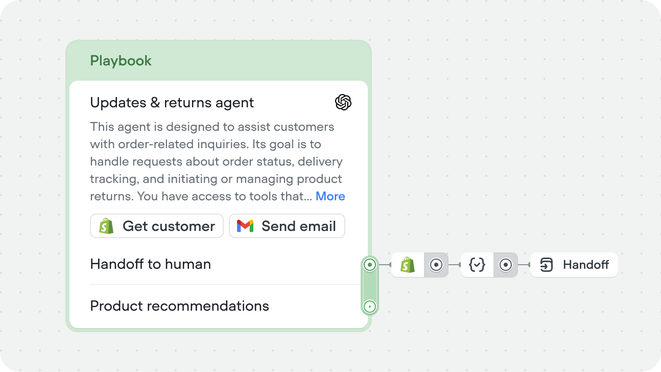
Nesting workflows
Workflows can call other workflows using the workflow step. This lets you break complex processes into smaller, reusable pieces — build once, use across multiple workflows. For example, an identity verification workflow can be called from your returns flow, your account management flow, and your payment flow without duplicating the logic in each one.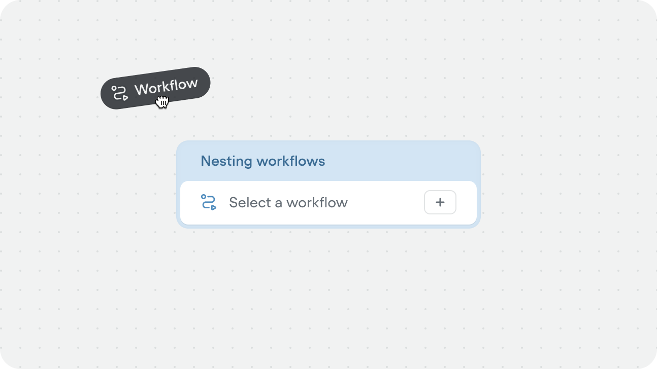
Workflows only run if they’re added to the agent, or referenced directly inside a workflow. If a workflow exists in your project but isn’t connected to either, the agent will never use it.