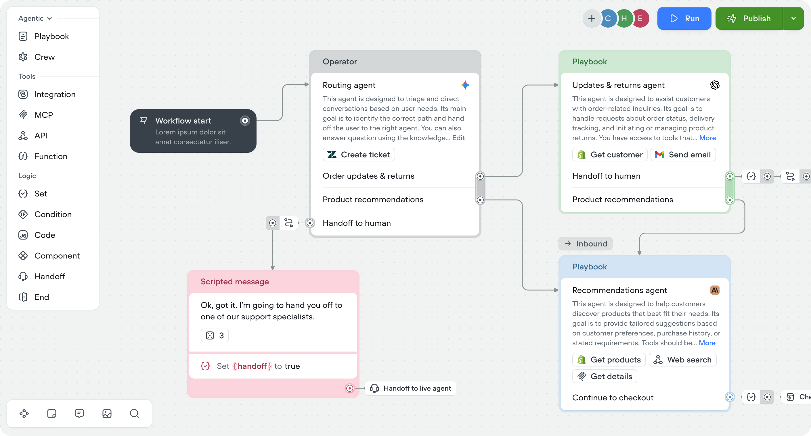
Components

Components are used to represent flows that are reused across the assistant. For example, your assistant may offer to connect the user to a live customer service rep at different points in the conversation. When you find yourself repeating the exact same series of user/function design over and over again, you can combine the series of steps into a singular component, which simplifies making changes further down the line.

All instances of a component are linked directly back to the original component object, so can be thought of like a function in classical programming. This behavior is different to the Template Library, which can be thought of more like a library of common patterns of blocks to easily copy and paste from, but can be changed on a case by case basis.

When your conversation reaches a component step, it will enter that component and execute the step(s) nested inside the respective component, and then exit the component and return to where you were before.

Leveraging components effectively will help you build a library of reusable blocks, which can significantly speed up the development process and ensure consistency across your agent’s conversational experiences.

Creating a component

To create a component, simply highlight (click and drag or press 'Shift' and drag your mouse over) the blocks you want to condense into a component, and click the “Create Component” button at the top of your header, or right click and select “Create Component”.

Modifying a component

When editing a component, it has its own fully fledged canvas from which you can add any kinds of blocks you want, even other components! The only important note is that instead of a Start step like you'll find in the Home workflow, or a Trigger step that you would find in any other workflow, you enter components through the unique Enter step (that looks just like Start, but has an arrow →).

Note: Don't try to do recursion with components (having a component call itself over and over again). The stack size is pretty limited and could cause instability in your agent.

To exit a component, you don't need to add an action or any block. Simply leaving the path disconnected in a component means that whenever your agents tries to go down that path, it'll break out of the component and return to the flow it came from.

Make sure you're aware of this behavior, because not properly connected components can lead to odd behaviors that are hard to debug. For example, if a JavaScript step failed, it would then go down a disconnected Fail path, which causes you to leave the component early.

The Components CMS

Voiceflow’s Components CMS allows for the creation, management, and reuse of components within your AI agent. Components are reusable flows that can encapsulate a specific functionality or a set of functionalities that you can integrate across different parts of your agent.

Components Table Overview

The Components CMS is organized to give you a clear view of all the custom components you've created:

  • Name: The identifier for the component, which should be clear and descriptive of its functionality.
  • Description: A brief explanation of the component’s purpose, detailing what it does and how it can be utilized in the conversational design.
  • Last Editor: Shows who last edited the component, which is particularly useful for collaborative projects.
  • Updated: Indicates when the component was last modified, helping you keep track of the most recent changes.

In the CMS, you can sort components by their name or the date they were last updated.

Creating and Managing Components

Adding a New Component

  • New component: Click on the ‘New component’ button to start creating a new piece of functionality.
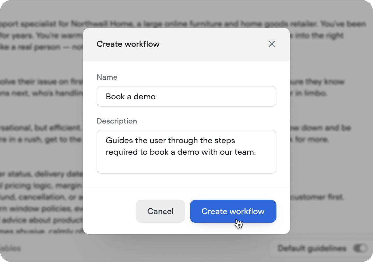
  • Enter details: The creation modal will prompt you to enter the name of the component and, optionally, a description that outlines its intended use.
  • Create component: After filling out this information, select ‘Create component’ to add the new component to your CMS.

Editing Components

  • Select Component: To edit a component, click on it from the list to open its details.
  • Edit component flow: Use the ‘Edit component’ button to modify its contents on the canvas.
  • Update description: Remember to update the description if you make changes to the component's functionality to ensure clarity.

The 'used by' field allows you to see where a component is being utilized. This allows you to better understand the impact of updating a component.


Deleting Components

Single Component

  1. To delete a single component, select the component you wish to remove, and in the editor view click the '...' (more options) button, and select 'Delete' from the dropdown menu.
  2. Confirm the deletion when prompted to remove the component from your CMS.

Bulk Deleting Components

  1. For bulk actions, select multiple components by selecting the checkboxes next to the component names.
  2. Once selected, on the bulk action toolbar above the table, click the 'Delete' button to initiate the bulk deletion process.
  3. Confirm the bulk deletion to remove all selected components.

Best Practices for Components

  • Descriptive Naming: Use clear, descriptive names that encapsulate the component's function.
  • Documentation: Maintain detailed descriptions for each component to clarify its use cases and functionalities.
  • Modularity: Design components to be as modular as possible, allowing them to be reused in various contexts.
  • Regular Audits: Periodically review and test your components to ensure they function correctly and remain relevant to your agent's needs.