> ## Documentation Index
> Fetch the complete documentation index at: https://docs.voiceflow.com/llms.txt
> Use this file to discover all available pages before exploring further.
# Card
> Display a card with an image, text, and buttons.
For agentic card generation where cards are dynamically created based on conversation context, use the [cards system tool](/documentation/build/tools/system-tools) inside a [Playbook](/documentation/build/playbooks) instead of the Card step.
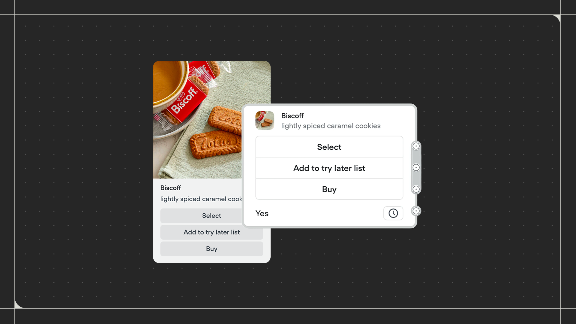 The Card step shows a visual card in your chat interface. Cards combine an image, title, description, and buttons in a single interactive element. Use this step when you want to present information visually, like displaying product details, showing profile summaries, or highlighting key features with actions users can take.
## Using the Card step
Drag the Card step onto the canvas and connect it to the step before it. Click on the step to configure your card's content.
Add an image by either uploading a file or providing a URL. Enter a title and description for your card, using text or variables. Then add buttons that users can click to continue the conversation.
### Configuration
* **Image**: Upload an image file or provide a URL. Supported formats include .png, .jpg, and .gif.
* **Card title**: Enter the heading text that appears on the card. You can use [variables](/documentation/build/data/variables) by wrapping them in curly braces (eg: `{product_name}`).
* **Card description**: Enter descriptive text that appears below the title. You can use variables and basic formatting.
* **Buttons**: Add clickable buttons to your card. Each button creates a connection point that you can connect to other steps in your workflow. Optionally add URLs to buttons. Unlike the [Buttons step](/documentation/buttons/steps/buttons), card buttons persist after the user clicks them, so users can return to the card and make another selection.
### Additional settings
* **No match**: When enabled, handles situations where the user's response doesn't match any button label. Your agent can send a message or follow a path in situations where the user's response is invalid.
* **No reply**: When enabled, handles situations where the user doesn't respond within a specified time. Your agent can either send messages periodically or follow a path after the specified time.
The Card step shows a visual card in your chat interface. Cards combine an image, title, description, and buttons in a single interactive element. Use this step when you want to present information visually, like displaying product details, showing profile summaries, or highlighting key features with actions users can take.
## Using the Card step
Drag the Card step onto the canvas and connect it to the step before it. Click on the step to configure your card's content.
Add an image by either uploading a file or providing a URL. Enter a title and description for your card, using text or variables. Then add buttons that users can click to continue the conversation.
### Configuration
* **Image**: Upload an image file or provide a URL. Supported formats include .png, .jpg, and .gif.
* **Card title**: Enter the heading text that appears on the card. You can use [variables](/documentation/build/data/variables) by wrapping them in curly braces (eg: `{product_name}`).
* **Card description**: Enter descriptive text that appears below the title. You can use variables and basic formatting.
* **Buttons**: Add clickable buttons to your card. Each button creates a connection point that you can connect to other steps in your workflow. Optionally add URLs to buttons. Unlike the [Buttons step](/documentation/buttons/steps/buttons), card buttons persist after the user clicks them, so users can return to the card and make another selection.
### Additional settings
* **No match**: When enabled, handles situations where the user's response doesn't match any button label. Your agent can send a message or follow a path in situations where the user's response is invalid.
* **No reply**: When enabled, handles situations where the user doesn't respond within a specified time. Your agent can either send messages periodically or follow a path after the specified time.